Huawei P20 Pro, analysis: the best zoom in a smartphone
Improving is always possible, innovating is always a challenge and overcoming is always a must when it comes to launching the flagship of the year. Lately the efforts have been deposited in the photograph, and this is what we perceive from the beginning performing the analysis of the Huawei P20 Pro .
The one that is at the moment the star mobile of Huawei has caught interest over his twin the Huawei P20 thanks to its triple rear camera. But the differences go further, as does the experience with this terminal that keeps the essence of the house very well, for good and for not so well. We tell you in detail.
Huawei P20 Pro data sheet
Huawei P20 Pro data sheet
| HUAWEI P20 PRO | |
|---|---|
| SCREEN | Fullview 6.1-inch OLED with resolution 2,240 x 1,080 points and 18.7: 9 aspect ratio |
| PROCESSOR | HiSilicon Kirin 970 + NPU |
| GRAPHICAL LOGIC | Mali G72MP12 |
| PRINCIPAL MEMORY | 6 GB RAM |
| SECONDARY STORAGE | 128 GB |
| TRIPLE REAR CAMERA | Leica Vario-Summilux optics. 40 Megapixel RGB sensor with Light Fusion technology and aperture f / 1.8. Monochrome sensor of 20 Megapixels and aperture f / 1.6. 8 Megapixel telephoto lens and aperture f / 2.4. Hybrid zoom 5x. Predictive approach. Slow motion video recording at 960 FPS and 720p |
| FRONTAL CAMERA | 24 Megapixels f / 2.0 |
| SOUND | Stereo speakers Processed Dolby Atmos. Bluetooth AptX HD, LDAC and LHD |
| WIRELESS CONNECTIVITY | 4x4 MIMO cat. 18 up to 1.2 Gbps, Bluetooth 4.2 and WiFi 802.11ac |
| OS | Android 8.1 |
| INTERFACE | EMUI 8.1 |
| BATTERY | 4.000 mAh and super charge at 4.5V / 5A |
| CHASSIS | Unibody glass and aluminum. IP67 protection |
| COLORS | Black, blue, pink and green / lilac (twilight) |
| PRICE | 899.90 euros |
Huawei P20 Pro 6.1 inch 6GB RAM 128GB ROM Buy Now
Huawei P20 Pro 6.1 inch 6GB RAM 64GB ROM Buy Now
Huawei P20 Pro 6.1 inch 6GB RAM 256GB ROM Buy Now
Design: adapting the Huawei style to a glazed back
The Chinese manufacturer has managed over the years to perfect that precise dance between being updated and having its own style while keeping pace with trends. Great changes are not always necessary; Samsung did it to move from the Galaxy S5 to the Galaxy S6 to go defining what we have seen in the successive until the Samsung Galaxy S9 + , Sony has done this year with the Xperia XZ2 and XZ2 Compact ( guessing something with the Sony Xperia Xperia XZ1 ) and Huawei did it again with the Huawei P10 .
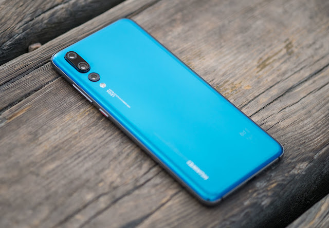
Some lines of style that we can see even in the expression of the P20 Pro's DNA, which maintains the curves in frames and edges of its predecessors, although updating them at two levels mainly: the materials and the front. Everything is wrapped by chrome edges that mean the continuation of the back glazed , breaking a bit with the established in terms of color, especially with that Twillight that seems to have been well received.
The one we tried was the one in the back in blue, with a tone that is relatively striking but without reaching the indiscreet or strident. So, breaks a bit with the established in terms of colors, but not at the level of that reflective finish, so fashionable, or a frontal that every time is not more familiar: hello notch, hello notch (and by triple game, because the three P20 carry it).
The finishes of the P20 Pro honor that second surname
So let's go in parts, because it's worth it. The finishes of the P20 Pro honor that (sometimes pretentious) second surname, because the feeling of quality is continuous , appearing from the beginning and staying as the terminal is handled.
Metal and glass are the ones to blame for this. Materials with an almost mandatory gloss finish that we may like or not, but within the inevitably striking that is rather discreet as we said, and although it will be impossible to avoid impregnated fingerprints in reality is not a serious problem as in other cases (perhaps due to some treatment).
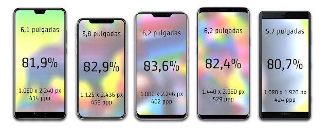
It is comfortable and is not heavy despite the dimensions, in fact without being a small terminal we can talk about a good job in terms of compaction. We speak of a 6.1-inch panel that fits on the front leaving little surface to the frames, occupying concretely 81.9%, remaining between 81.2% of the LG V30s ThinQ (without notch, maintaining symmetries) and the 82.4% of the S9 +, below his colleagues bangs the iPhone X (82.9%) and the ASUS ZenFone 5 (83.6%).
Notch or not notch, that's the question. At least in terms of aesthetics, because when you take advantage of the front the percentages are at the same level whether or not the "notch". From left to right: Huawei P20 Peo, iPhone X, ASUS ZenFone 5, Samsung Galaxy S9 + and Sony Xperia XZ2.
The fact that it does not reach the pole position in the use of the front can be due to a decision of the house that has its followers and its detractors: keep the fingerprint reader in the front. It is, in fact, almost the only top of the range (along with the HTC U11 and the iPhone 8 and 8 Plus ) that retains this location, at least in the P20 and P20 Pro, because the Huawei P20 Lite does place it in the back .
The Huawei P20 Pro, with reader on the front, USB type-C and without audio jack.
Thus, regarding the front Huawei has decided to resort to the "Apple strategy" and pull notch for the front camera and sensor module (we do not say " Essential strategy " because at the moment the imitation seems to tend to Cupertino, in view of the acts). The reasons seem obvious, reduce frames to the maximum and be fashionable, although here we find two particularities: a disappointment and a good gesture .
Contrariety we mentioned before: the fingerprint reader remains in the front , which limits the extreme frames and reach lower edges as their rivals. The reader is almost elliptical and this makes it easy to occupy the minimum, but move it to a side or the back would have given a few millimeters more (although the P20 Lite remains at 80.9% thanks in part to that there is no reader but there is logo).
The good gesture: choose the user . The notch does not like everyone (and worse yet: there are not adapted apps as we will see later), and in EMUI the user can load it by doing a Samsung, or what is the same, giving symmetry when loading the notch .
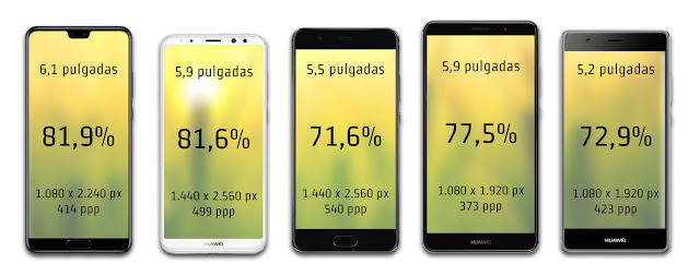
So, with a front finger reader, does it compensate for notching? If the goal was effectively to scratch millimeters of use, the answer is affirmative, achieving a gain of 10% of the surface in favor of the panel if we compare the percentages of frontal use by the screen of their predecessors.
Little by little Huawei models have been reducing frames on the front and also defining style. From left to right: Huawei P20 Pro, Huawei Mate 10, Huawei P10 Plus, Huawei Mate 9 and Huawei P9 Plus.
| HUAWEI P20 PRO | HUAWEI P10 PLUS | HUAWEI MATE 10 | HUAWEI P9 PLUS | HUAWEI MATE 9 | |
|---|---|---|---|---|---|
| DIMENSIONS (MM) | 155 x 73.9 x 7.8 | 153.2 x 74.2 x 7 | 150.5 x 77.8 x 8.2 | 152.3 x 75.3 x 7 | 156.9 x 78.9 x 7.9 |
| SCREEN (INCHES) | 6.1 | 5.5 | 5.9 | 5.5 | 5.9 |
| FRONTAL SURFACE (CM2) | 89.35 | 113.67 | 117.08 | 114.68 | 123,79 |
| EXPLOITATION | 81.9% | 71.6% | 81.6% | 72.7% | 77.5% |
| WEIGHT (G) | 180 | 165 | 186 | 162 | 190 |
| VOLUME (CC) | 89.35 | 79.57 | 96.01 | 80.27 | 97.79 |
Apart from aesthetics, the summary is that it is a very well constructed and comfortable terminal . The finishes are made with taste and care and probably with the idea that this also forms part of the claim. The user who looks askance at the P20 Pro also makes it attractive, because what has not gone unnoticed, much less is to include three cameras in the back.
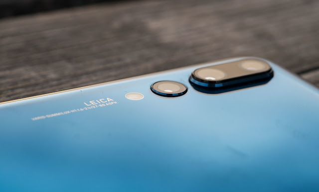
The signature of Leica accompanying as always to the rear cameras. In this case there are three, all protruding but especially the main and monochromatic.
Screen: a good dose of adjustments that welcomes OLED
If you give prominence to the screen is for it to comply, apart from showing off. It is in fact another difference with his generation brothers, given that the Pro rises to 6.1 inches with ratio 18.7: 9 opting for the OLED instead of the IPS, but still maintaining the maximum resolution in FullHD +.
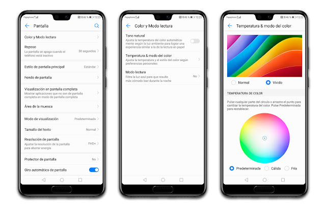
We say maximum because it is something optional for the user (as we have seen previously also in Samsung Experience), being one of the extra options that EMUI provides the user to adjust the screen. Temperature, vividness of the colors and disposition (or presence) of elements on the screen are some of the characteristics that we can adapt to our liking, and take the reins in this we always like (positive minipunto for EMUI).
The good, if it is adaptable, twice good. The Huawei software layer allows you to adjust the temperature of the targets and the intensity of the colors among other parameters of the screen.
Apart from giving us options, does or does not the Huawei P20 Pro screen? In most situations, yes, in fact it should be noted that the automatic brightness adjustment works very, very well (something that does not happen as often as it seems) and the "Natural tone" is also quite successful, adopting a temperature of targets according to the environment in which we are.
Without knowing the data of the maximum brightness in nits, in general very well to respect and also in terms of color and contrast, both indoors and when they directly give the solar beams. It turns out to be a good panel for any type of content, with good tactile sensitivity and detail to spare (as much of the FullHD vitamin versus the resolutions with "K").
With 2,240 x 1,080 pixels the AMOLED panel of the P20 Pro gives a satisfactory level of detail.
Being AMOLED, yes, we can not escape the losses of brightness and degradation to green when we open the viewing angle , but it is nothing out of what we expect and we have to tilt or flip beyond the comfortable viewing angle to look for them . The content is also seen in terms of contrast and sharpness.
And the notch ? Well as we have said the notch can be a feature of our terminal or it can be Schrödinger, because we can hide it at our whim. What the system does is "dye" the black side entries, so that there is a straight black strip under which the notification bar rests.
Any functional advantage? No, except having about two millimeters of extra screen that otherwise occupies the conventional notification bar. That is, if we throw from one side or another we will always see the curtain of notifications , and not different elements as it does on the iPhone X.
The disadvantages (for those who consider them) would be aesthetic and for those who give importance to the symmetry, the layout of the notification icons or the distribution of elements. Not all the apps are adapted and sometimes the notch steps on the content, as it happens with the Instagram Stories, or they directly put a shadow by mimicking the notch in the status bar.
Nor will it be to our liking if we do not like to miss any of the notification icons, although the operator disappears if they pile up favoring that they appear all the way to the notch. There are also different visualization options , being able to change the icons by numbers agglutinating them (we will see it in the software part).
Choose the option that we choose for the upper part, the summary is that we give a good assessment to this panel after having a good experience and a good assortment of adjustments to adapt it to our taste. And above all for not giving problems in any situation either at the level of brightness. Chapeau , Huawei.
Software: personalization vs . Impositions, fight!
EMUI is and will be an important part of Huawei's mobile work, and the P20s carry the latest version of the house's software layer. In the P20 Pro we have experienced how is EMUI 8.1.0 on Android Oreo 8.1.0 , and we have had a little bit of everything.
First of all recommend that you check the status of software update if you buy one of the latest Huawei devices, because it may come with the previous software version and the new one is more stable. In addition, with it come the latest news, including a slight update to the camera app (which we will talk about below).
Are there many changes in this one in terms of functions or aesthetics? No, the DNA of EMUI 8 is stoically preserved due to trends and changes of strategy on the part of the competition and the layer, although adapted and updated to a small degree, is an old acquaintance . It is EMUI, the invasive, the characteristic, the extravitaminated. The one of all the life.
It comes well served from home apps , with its tools folder and third-party apps. What we can do with all these will depend on the case, not all can be disabled or uninstalled either from Google or EMUI (third parties can remove them).
There are many pre-installed apps and not all can be removed, but the layer gives enough options to adapt to the user's taste
This will probably make us duplicate apps for the same use without being able to avoid it, which will not be annoying either unless we care that they remain on the screen or in the app drawer. For other things, however, the layer gives enough options for adaptation to the taste of the user .
For example the adjustment of the notifications that we have commented before, also of the toggles of the curtain or of if we want that the screen and / or the LED when receiving them turns on. What we can not deactivate is that they show the notification point, which will indicate activity or processes in progress (downloads, reproductions, etc.).
Another interesting aspect that we can vary here and that does not always allow the manufacturer is the strip of navigation buttons . We can order them, add that very useful button to download the notification curtain or simply leave a single virtual button or use the fingerprint reader for the entire interaction.
This last option will be the one that suits them if we want to make the most of this use of the front by the screen, since it gives the half centimeter that otherwise occupy the buttons. And it should be noted that it is very comfortable and works very well , both at the level of touch sensitivity and execution.
A collation of this comment that from the beginning we will be appearing the option that the apps appear in full screen and occupy that ratio 18.7: 9, being able to set it for each and revoking it in case we do not like it or it does not end to work well. As we said, in addition, we can hide the notch if it does not convince us either.
Other particularities of EMUI are the usual optimization tools that manufacturers usually provide so that users can improve as much as possible (and without advanced software knowledge) the operation. Taking into account that it is quite difficult to have all the RAM occupied and that the terminal is so fluid, in practice they are used little, but they are usually an aid for passive optimization and better control aspects such as the background activity of certain apps.
Although it is far from being just a software issue, it is worth mentioning the functioning of facial recognition as an alternative method of unlocking. The reading and detection of the face is very fast, and will store it even when the light does not abound.
However, the best thing will always be to facilitate this task so that later there is an effective identification. In general this works well, even if we put on glasses or change the hairstyle, but it does not work well at 100%and sometimes it will not detect the face well, especially in low light.
The good thing is that in most situations reading is effective and also very fast. And it is not necessary that we activate the screen since when lifting the terminal it already does it by itself.
In most situations, the face reading is effective and also very fast
Finally in this section comment that we can choose whether to see the apps on several desktop pages (well come by default) or opt for the drawer of apps , as Android Stock offers.
Cameras: photography is not redefined with three cameras, but the experience does
The camera is one of the main axes of innovation of mobile phones since a few years ago and it can be deduced that it is an aspect that the potential buyer has in great consideration when it comes to changing smartphone. There will always be room for improvement, for example for night photography (the eternal enemy) and it is quite impressive what they have managed to achieve in devices less than a centimeter thick, but Huawei have opted to give themselves a little more that small space embedding three cameras .
It is perhaps the main characteristic of this P20 Pro and the one that makes the most difference with its twins who have "only" two cameras . The bet we saw it in detail in the post on these three cameras , commenting in detail what this triple bet involves a RGB sensor of 40 megapixels and aperture f / 1.8, a monochrome of 20 megapixels and aperture f / 1.6 and a telephoto lens 8 megapixels and aperture f / 2.4.
The numbers, however, are all that the manufacturer wants to highlight. With the Mate 10 and tried to emphasize the participation of the NPU in photography, especially talking about an automatic improvement according to the scenes, and with the P20 Pro what premiere is the intelligent stabilization or AIS .
We could already prove this in the contact and we liked it a lot. But then we'll talk more about the AIS in detail, as well as the rest of assistance that the manufacturer says this feature, such as help according to the elements identified or the predictive approach.
We do not forget the front camera, which comes alone but integrating a sensor of 24 megapixels and aperture f / 2.0 . With fewer applications than the triple rear combination, it is also equipped with portrait mode (which we will analyze in detail later).
But first let's maintain customs and let's walk around that renewed camera app.
Camera app
In the latest camera comparisons of the best smartphones of the momentwe could not include any Huawei P20 because they were not yet out of the oven, but if there was their predecessor Mate 10 who is not lame in photographic subject. There we saw that there were two types of apps, the very brief and the very loaded , and that the Chinese manufacturer tended rather to the latter.
This in a certain way may have changed a bit, although the app remains essentially above all at an aesthetic level , changing in terms of navigation and the arrangement of elements. We have the main sections as a carousel, navigating them with swipes to the left and right and having as fixed elements the possibility of changing the color mode, the flash or doing a live photo .
Between these fixed sections we see some of the changes: the night mode , previously available between the secondary ones, now has its own tab between the portrait mode and the opening mode. A comprehensible change since night photography is one of the main beneficiaries of the AIS as we will see later in detail.
The mode that remains "hidden" is the HDR, which is among these secondary options along with monochromatic, fast camera, slow motion or panoramic. The monochromatic mode, by the way, has been updated offering the options of portrait, opening and manual addition to the automatic, and the P20 Pro also rises to the slow motion at 960 fps (although in the end the crux of the matter is what allows the app almost more than resolution or performance).
We will access the front camera in the modes it supports, being the automatic, the portrait mode and the video. As it could not be otherwise we have a tool for "beauty" , but we can only activate it if we go to portrait mode (although if we do not want the bokeh we can deactivate it and stay with only up to ten degrees of "beauty").






No comments:
Post a Comment